Checkered Tulips: Afterimage I

Remember how we used to cut out construction paper flowers as kids? One of my favorites was the simple three-pronged tulip. It reminds me of the garden my dad planted every spring in Ohio.
So I made a one-liner tulip doodle and cast it into a 30”x 30” panel covered with a skewed checkerboard grid. The tulip would be woven into the mix, along with a doodle butterfly foraging for nectar.
I decided to focus the color palette on the experience of seeing an afterimage. For years, I’ve explored this trippy phenomenon with my color fundamentals students, but I’ve never featured it in my own work. The tulip would be cherry red. To find the afterimage, I stared at a cherry red paint swatch for 30 seconds. About 15 seconds in, the edges started glowing with an emerald light, the afterimage color for the stem and leaves.
COLOR PALETTE
Achromatics: Black, Grey, White
Reds: Cherry Red, Watermelon, Strawberry Shake
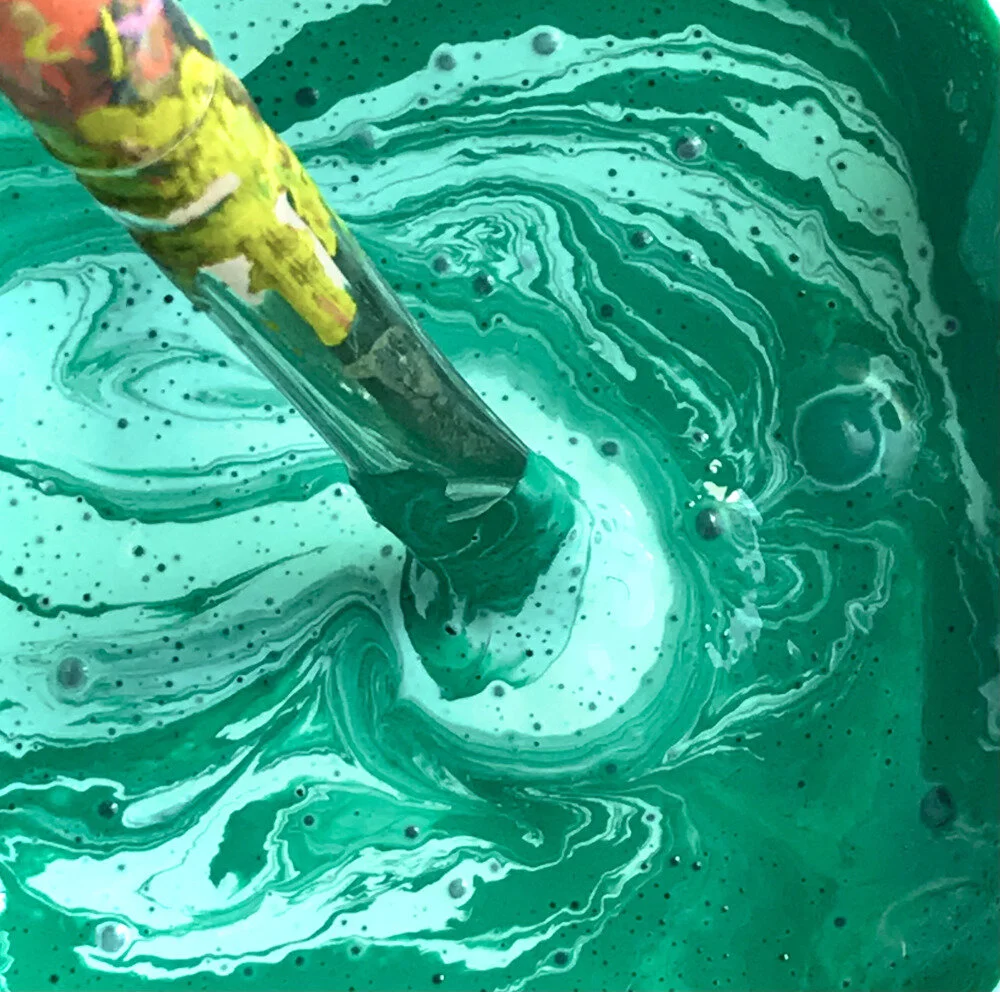
Greens: Emerald, Jade, Mint
Yellows: Lemon, Honey
Blues: Indigo, Cornflower

Lately, I’ve been obsessed with coaxing acrylic paint to look like gouache. Flat, smooth, and creamy. I wanted the brushstrokes to melt into each other, with no paint buildup along the edges of the shapes. This required multiple coats of paint and lots of 350 grit sandpaper.
When the painting was completed, two things happened. The tulip insisted on being turned sideways. And its optical illusion afterimage insisted on becoming a companion painting. For the second version, every color would be the visual complement of its predecessor. So the second abstract butterfly transformed into indigo.
The paintings form a kind of duet. Both tulips are turned sideways—caught in the searchlights. This makes sense to me, as global warming has turned nature sideways. I’m starting to work now on a second set of afterimages . . . the checkered romance between bloom and butterfly endures.
Yours in color,
Luanne