If walls could talk #2

Rear entrance at the Blanton Museum of Art, UT Austin.
Exploring color stories in museum exhibitions.
This blog is part of a series. You can read the first installment here.
While we’re on the theme of red, I visited the Blanton Museum at the University of Texas a few days ago to listen again to what the walls had to say. Due to an ambitious construction project currently underway (new outdoor performance spaces, a public patio, a new garden), the main entrance was walled off. To get into the museum, visitors had to find their way around the back to a nondescript door at the end of a long, narrow hallway. But as soon as I walked through it, I knew I was in the right place because I was greeted immediately by a striking wall of carmine red.
This red is actually a close relative of the fire engine red I wrote about last time, from the American gallery at the Museum of Fine Arts, Houston. Both colors are mid-value reds, not too light and not too dark. Both are highly saturated. But where the fire engine red is “hotter” (more yellow), the carmine red at the Blanton was much “cooler” (2% more magenta, 24% less yellow, and 14% more black to be exact).
You can see these differences for yourself by looking at the CMYK “color recipe” under each swatch below:

Fire Engine Red
Hex code: #FC040F
CMYK: 0% cyan, 98.4% magenta, 94% yellow, 1.2% black
97.6% saturation, 50.2% lightness

Carmine Red
Hex code: #D70040
CMYK: 0% cyan, 100% magenta, 70.2% yellow, 15.7% black
100% saturation, 42.2% lightness
I was drawn to this seductive, rosy hue on the right for several reasons. Red is a tricky color to use; a little red goes a long way. Glamorous and eye-catching, red is a diva color. It can easily suck the air out of a room. This was indeed the case in Houston at the 18th and 19th century American Gallery, where the more aggressive red on the left suffocated the art with boisterous visual noise. This happened not only because they used so much of it, but also because hotter colors tend to draw more attention than cooler ones.
At the Blanton, the design team didn’t smother the entire hallway with a loud, red-hot hue. Instead, they used a cooler, more subdued red—and they didn’t use too much of it. The other walls were painted a clean, airy white to provide some contrast and give the eye a rest. Their color design for this back hallway also struck me as a creative solution to the challenge presented by the circumstances—the main entrance was a confusing, chaotic mess, and the unexpected appearance of this beautiful red in the temporary entryway was both inviting and anchoring.
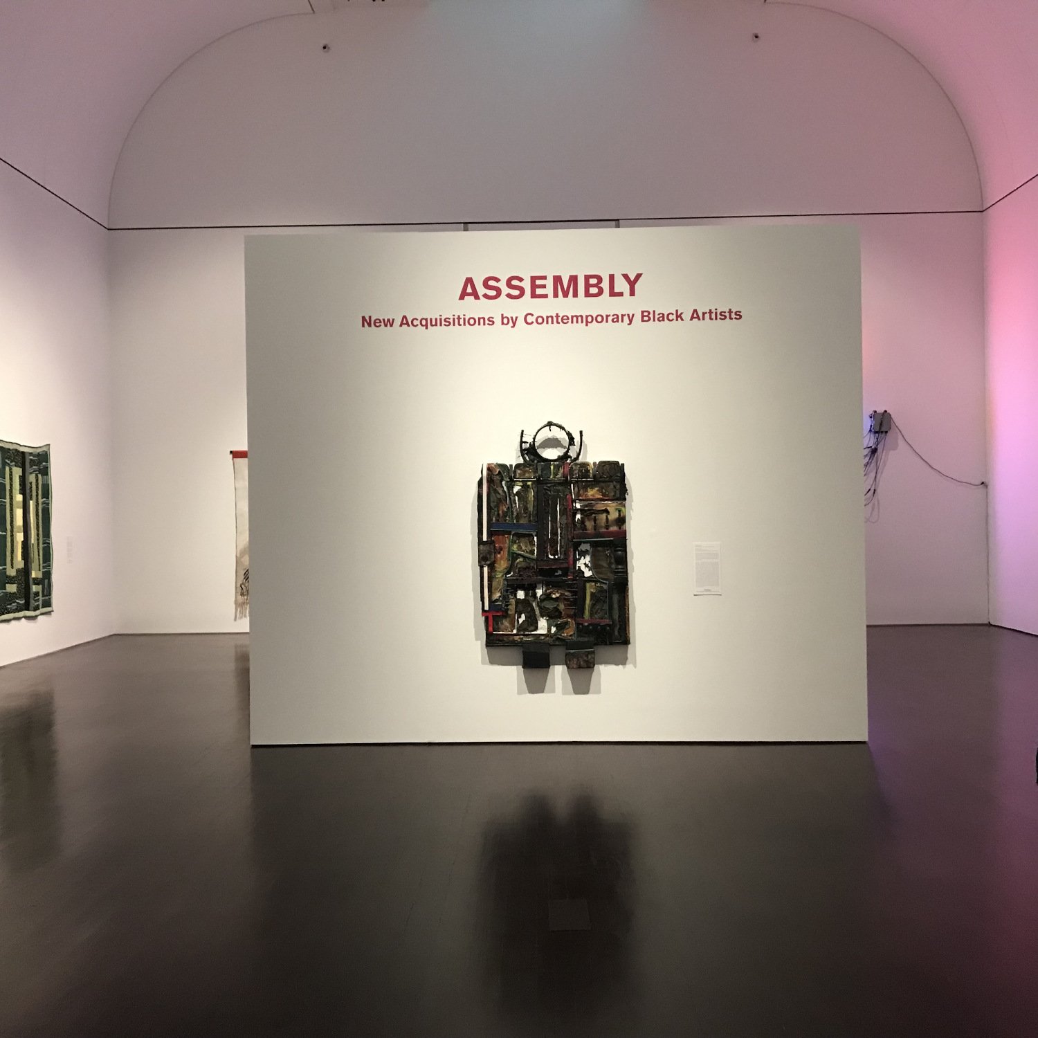
Assembly: New Acquisitions by Contemporary Black Artists, Blanton Museum of Art.
Upstairs on the second floor, I was excited to check out Assembly: New Acquisitions by Contemporary Black Artists because it represents another potential point of tension in color design—the use of dark, bold hues in exhibits of work by artists of color.
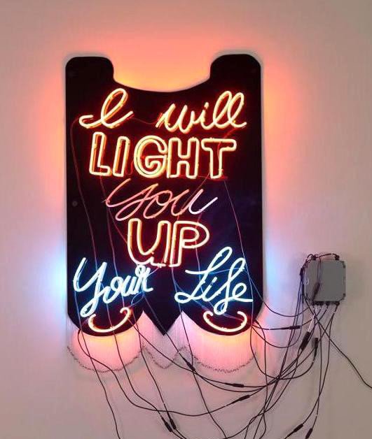
Light Up Your Life (For Sandra Bland), by Cauleen Smith.
Since at least the mid-twentieth century, “gallery white” has been the gold standard for presenting “serious” modern art made by highly regarded, mostly white male artists. By contrast, color palettes for exhibitions involving artists of color (and other art world outsiders) tend to be darker, more colorful, and more saturated. The unspoken message about “otherness” is obvious.
I walked through just such a white-walled gallery of modern art en route to the Assembly exhibition. To my delight, the walls of Assembly were also painted white, breaking the usual pattern. But there were also delicate splashes of color—in the carmine red of the show title, and in the enchanting rose light emanating from Cauleen Smith’s neon sculpture Light Up Your Life (For Sandra Bland), which reflected from the ceiling, walls, and polished floors.
I think the lighting design for this exhibition is brilliant. The Blanton chose to dignify these works by contemporary black artists with the classic elegance and formality of traditional gallery white. Yet they also took advantage of colored lighting to transform the flatness and sterility that stark white walls can sometimes create into an immersive, ethereal atmosphere.
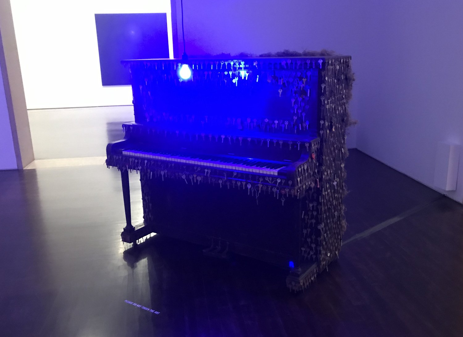
Spellbound, by Nari Ward.
Engaging the fullness of the space in this way shifts the visitor’s experience from simply observing artworks to participating in a whole spatial drama. In this light, individual pieces take on new layers of personal involvement. Nari Ward’s Spellbound, for example, presents an upright piano coated in Spanish moss and old keys bathed in a moody shade of cobalt blue, while video collages of “forgotten histories” play across the old, scavenged instrument.
If you’re in Austin, it’s a wonderful show—up at the Blanton through May 8th.
Read the next post in “If walls could talk.”